
Brand Teams: 6 Positioning Map Examples, Research Backed Templates
A positioning map, also called a perceptual map, plots how customers view competing brands or products along two meaningful attributes. This page gives six ready-to-use examples, editable templates, and a step-by-step checklist, drawing on guidance from Harvard Business School Online and the Harvard Business Review, plus consulting frameworks used by brand strategy consultants.
TL;DR:
- Most effective axes for positioning maps reflect customer perception, such as centrality and distinctiveness, rather than defaulting solely to price and quality.
- Using survey or conjoint research to plot competitors provides more reliable insights than workshop estimates alone, especially for strategic decisions.
- Cross-category competitors can threaten your brand if their products are compared directly by customers, highlighting the importance of selecting relevant axes.
- Clusters indicate where competitors crowd and compete on marginal differences, while white space suggests growth opportunities, but only if customers value those positions.
- Prioritize getting the right axes over creating a visually appealing map, because misleading attribute choices can lead to poor strategic decisions.
Table of Contents
- Positioning map examples across categories
- How to create a positioning map step by step
- Choosing the right axes and avoiding common mapping mistakes
- Tools and templates for building maps quickly
- Turning map insight into a positioning statement
- How we use positioning maps in client work
- What positioning maps get wrong, and what actually matters
- Where our team fits once you have a map
- FAQ
- Sources
Positioning map examples across categories
The fastest way to understand positioning maps is to see several sides by side. Each example below pairs a category with two axes, the insight the map reveals, and a note on how to plot a simple version yourself.
Automotive: price versus sportiness. A classic two-axis map plots vehicle price against a sportiness score drawn from reviews or test-drive ratings. According to Rework’s perceptual mapping resource, this view can expose an underserved cluster: cars that feel sporty but sit at a modest price point. A brand like Mazda has historically filled that “sporty for the price” gap rather than competing head-on with premium performance badges. To plot your own version, score five or six competitors on a 1 to 10 sportiness scale from review language, then plot against list price.
Beverages: price versus target market or lifestyle. When Harvard Business School Online mapped White Claw against other hard seltzers using price and target market, the more useful competitive picture came from a brand in a different category altogether. Corona, a beer, turned out to be a meaningful threat because customers were choosing between the two at the same occasion. The lesson: your axes should reflect how customers actually shop, not how your category is officially defined.
Fast food: price versus perceived food quality. Mapping quick-service brands on price against a quality perception score (gathered from reviews or a short survey) often reveals white space in the “higher quality, still affordable” quadrant. Chipotle is frequently cited as having built its growth around that exact gap, according to Rework, rather than competing purely on speed or price.
B2B software: ease of use versus feature depth. For software buyers, the tension between simplicity and capability is usually the sharpest axis pair. Most tools cluster at one extreme: either simple and limited, or powerful and complex. A product that holds both ease of use and feature depth at once is rare enough that the combination becomes a genuine differentiator rather than a marketing claim.
The centrality-distinctiveness (C-D) map. The Harvard Business Review’s centrality-distinctiveness framework asks customers to rate brands on two different dimensions: how central a brand is to the category (does it feel like the obvious choice) and how distinctive it is (does it stand apart). Both are scored on a 0 to 10 scale, and bubble size can represent sales, price, or another performance metric. This map links perception to commercial outcomes, which a simple price-versus-quality grid may not fully capture.
A few patterns show up across all of these examples:
- Clusters reveal where competitors crowd together and compete mainly on marginal differences.
- Empty quadrants, often called white space, suggest an opportunity, but only if customers value what sits there.
- Bubble sizing (by sales, price, or share) turns a static perception snapshot into a performance story.
- Cross-category competitors often surface only when axes reflect customer choice, not industry classification.
How to create a positioning map step by step
Building a map that holds up under scrutiny takes more than two axes and some guesswork. Harvard Business School Online outlines a process that starts with defining the category and ends with using the result to guide decisions, and we follow a version of that sequence with clients.
- Define the category and segment. Decide exactly who you are mapping and against whom. Mixing segments, for example enterprise and small-business buyers, produces a map that answers no one’s question well.
- Select two axes. Choose attributes that are measurable, meaningful to customers, and tied to a decision you can actually act on. A validity checklist helps here: can you measure it consistently, do customers care about it, and would a shift on this axis change your strategy?
- Choose a data source. Workshop judgment from your team works for a fast internal draft. A representative customer survey is needed before sharing the map externally or making a budget decision. Preference or conjoint research, as described in the SAS marketing research technical note, is appropriate when you need to estimate trade-offs rather than just display them.
- Plot coordinates and size bubbles. Place each competitor based on your chosen data source, then size bubbles by sales, price, or share to show which positions are also winning in the market.
- Interpret clusters and white space, then decide when to escalate. Look for crowded clusters, credible gaps, and any position close enough to yours to count as a real threat. If the map cannot explain why customers choose one option over another, that is the signal to move to conjoint or MDPREF analysis rather than trust the two-axis picture.
Pro Tip: Treat a workshop-built map as a hypothesis, not a conclusion, and label it that way on the slide until survey data confirms it.
Choosing the right axes and avoiding common mapping mistakes
Axis selection is where most positioning maps go wrong, and the failure is rarely visible until a strategic decision rests on a shaky foundation.
Price versus quality is the default pairing for a reason: it is easy to gather and easy to explain. But the Harvard Business Review’s centrality-distinctiveness framework suggests this pairing often misses the more important question, which is whether a brand feels like the obvious choice in its category and whether it stands apart from competitors. HBR’s analysis warns that distinctiveness without centrality can be commercially marginal: standing out means little if customers do not also see you as a credible option.
A second common error is confusing perception with preference. A positioning map shows where customers think a brand sits, not which option they would actually choose. When the decision requires estimating trade-offs, such as how much a customer would give up on ease of use for more features, the SAS technical note recommends conjoint or preference analysis instead, and the University of Washington’s conjoint analysis technical note explains how these methods estimate attribute utilities and simulate likely choices.
A third mistake is mapping only the competitors your category officially recognizes. The White Claw and Corona example from Harvard Business School Online shows why this fails: the real threat came from a different product category entirely, because that is what customers actually compared it against.
Before trusting any map, run it against a short checklist:
- Is each axis something customers can actually perceive and rate consistently?
- Would a shift along this axis change a real strategic decision?
- Have you included every option customers genuinely choose between, not just official category rivals?
- Is the map’s confidence level (workshop guess, survey, or conjoint study) annotated for anyone who views it later?
Tools and templates for building maps quickly
Several resources make it faster to produce a presentation-ready map, though none of them replace the research step.
- PowerPoint template packs. Slide templates are widely used to share positioning maps in workshops and executive reviews. Download a template, adjust the axis labels to your category, and always annotate the data source directly on the slide so no one mistakes a guess for research.
- Visual Paradigm’s perceptual map templates. These templates speed up the visual layout considerably, but they do not supply valid competitor coordinates. Those still require the research steps covered above.
- GraphMake’s perceptual map maker offers free two-axis plotting with PNG export and optional bubble sizing, useful for fast workshop prototyping. GraphMake itself notes that manually placed positions are judgments unless backed by survey data, so treat quick prototypes as drafts.
Template hygiene matters more than template choice. Every map, whether built in PowerPoint, Visual Paradigm, or GraphMake, should carry a visible data source note and a recommendation for when to move from a workshop sketch to a survey-based version before it informs a budget or pricing decision.
Turning map insight into a positioning statement
A map earns its value only when it changes a decision. The standard positioning statement format captures that decision in one sentence: for [target segment], [brand] is the [category] that [key benefit], because [reason to believe]. A brand sitting in the “affordable and sporty” quadrant of an automotive map, for instance, might land on: for budget-conscious drivers who want performance, this model is the sedan that delivers a sporty feel without a premium price, because its engineering comes from the same platform as the brand’s performance line.
Which move makes sense depends on the quadrant. A brand in a crowded, central cluster needs a distinctiveness play: new messaging or a feature investment that separates it from neighbors. A brand in an empty but credible quadrant can defend that space with pricing or distribution choices that reinforce the gap before a competitor notices it. Track progress by re-measuring centrality and distinctiveness scores alongside sales or share over time, not just the map’s visual position.
Pro Tip: Revisit the map on the same cadence as your planning cycle, since perceptions shift faster than most teams expect.
How we use positioning maps in client work
At Quincy Samycia, we built The Golden Spiral™ and Brand-Backed Performance™ frameworks specifically to connect perception data like a positioning map to measurable outcomes across product, marketing, and sales. A map on its own tells a team where a brand sits. The frameworks push further, aligning that insight with pricing, messaging, and go-to-market decisions so the map becomes a working input rather than a one-time slide.
A map shows you where you stand. The harder work is deciding what to do about it, and making sure product, marketing, and sales move together once you do.
Teams considering a workshop or positioning audit typically start by bringing their current map, or the lack of one, to a first conversation.
What positioning maps get wrong, and what actually matters
Most advice on positioning maps treats the chart itself as the deliverable. It is not. The map is a hypothesis-generating tool, and the real work starts after the dots are plotted: deciding whether a cluster is a threat worth responding to, or just noise from a crowded category that does not affect your actual buyers.
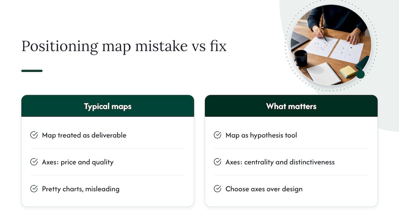
The bigger blind spot in conventional guidance is the assumption that price and quality are the only axes worth testing. They are the easiest to gather, which is why they dominate templates and tutorials, but the centrality-distinctiveness research suggests the more useful question is whether customers see a brand as central to the category at all. A brand can look fine on a price-quality grid and still be fading from relevance.
If you take one thing from this page, prioritize getting the axes right over getting the chart pretty. A beautifully designed map built on the wrong two attributes will mislead a leadership team with more confidence than a rough sketch built on the right ones.
— Quincy
Where our team fits once you have a map
Once a map surfaces a real gap or threat, the next step is usually a decision about messaging, pricing, or where to invest product effort, and that is where a brand positioning audit or workshop tends to pay off fastest. We run positioning audits, executive workshops, and advisory retainers built specifically to turn a map like the ones above into a prioritized plan.
A typical engagement starts with a short audit of your current positioning, moves into a working session to test axes and plot competitors with real data, and ends with a positioning statement and a short list of actions for product, marketing, and sales. If your team prefers an in-person session, we also lead speaking and workshop engagements built around this exact process.
FAQ
What is a positioning map?
A positioning map, also called a perceptual map, is a two-axis chart that shows how customers perceive competing brands or products relative to each other. It is used to spot clusters of similar competitors, identify credible white space, and inform strategic decisions about messaging, pricing, or product investment.
How do I create a positioning map?
Start by defining your category and customer segment, then choose two axes that are measurable and meaningful to customers. Gather perception data through team judgment, a survey, or preference research, plot competitors against your brand, and interpret clusters and gaps before deciding on next steps, following the process outlined by Harvard Business School Online.
What are some examples of positioning?
Common examples include mapping automotive brands on price versus sportiness, beverages on price versus target lifestyle, and fast food on price versus perceived quality. A more advanced version, the centrality-distinctiveness map used by the Harvard Business Review, links perception directly to sales or share performance.
What are the four types of positioning?
Positioning approaches generally fall into categories based on where a brand sits relative to the category center and how distinct it appears: central and distinctive (aspirational), central but not distinctive (mainstream), distinctive but not central (unconventional), and neither central nor distinctive (peripheral). These groupings come from the centrality-distinctiveness framework rather than a single universal standard, so definitions can vary slightly by source.
Can I build a positioning map without survey data?
Yes, a workshop-based map using team judgment is a reasonable starting point, but it should be labeled as a hypothesis rather than a conclusion. Before using the map for a major pricing or product decision, validate it with representative customer research or conjoint analysis, as recommended in the SAS technical note.
Sources
- How to Use Perceptual Mapping to Assess Your Competition — Harvard Business School Online
- A better way to map brand strategy — Harvard Business Review
- Marketing research technical note — SAS
- Perceptual map templates — Visual Paradigm
- Perceptual map maker — GraphMake